Design study
Design study: colors and the uncanny valley
What should Kourai look like so that people enjoy having it around? Our approach to color combinations and the uncanny valley effect.
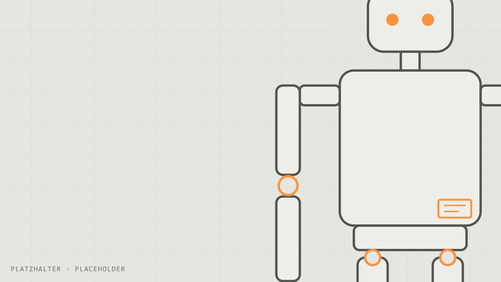
The question
A robot that is meant to work next to people in everyday life has to do more than function. People also have to enjoy having it around. That is why we study which appearance is perceived as friendly and family friendly.
The uncanny valley
In 1970 the Japanese roboticist Masahiro Mori described an effect now known as the “uncanny valley”: the more humanlike a robot looks, the more likeable it seems, but only up to a certain point. If it looks almost but not quite like a human, the effect flips and it suddenly appears eerie.
Our approach
We deliberately want to stay just before the “dip”:
- clearly recognizable as a robot, not as an imitation human
- friendly, simple shapes
- a face that can show expression without being realistic
[PLACEHOLDER: sketches or renders of the designs, for example with the Figure block or as a before and after comparison with Compare.]
Color combinations
[PLACEHOLDER: which color combinations did you compare? Which one looks the friendliest, and why?]
| Combination | Effect | Rating |
|---|---|---|
| [PLACEHOLDER] | [PLACEHOLDER] | [PLACEHOLDER] |
| [PLACEHOLDER] | [PLACEHOLDER] | [PLACEHOLDER] |
How we test this
- Survey: we ask as many people as possible which designs appeal to them. The results are on the research page.
- Expert interviews: we collect feedback from specialists in AI and robotics.
- Evaluation: [PLACEHOLDER: how do the results feed into the final design?]